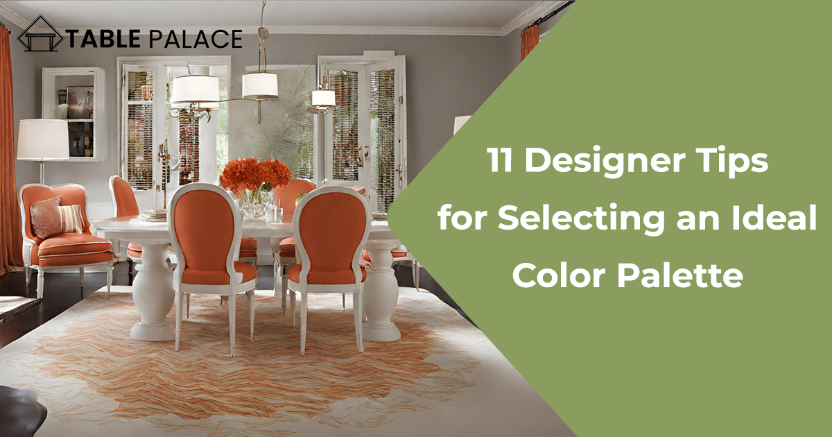
Choose a Color Scheme
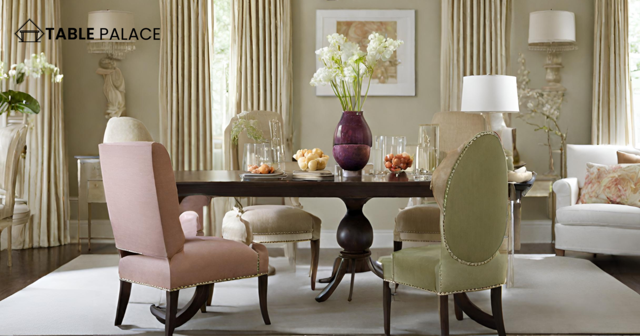
Color is the crucial element for harmonizing a variety of accessories. In this girl’s bedroom, a pom-pom pillow and blanket, a contemporary painting, bold fabrics, and even a balloon dog inspired by Jeff Koons all contribute to a lively and playful atmosphere. The cohesive use of analogous colors like pink, purple, and orange ties together these diverse pieces.
Start With the Formal Areas of the House
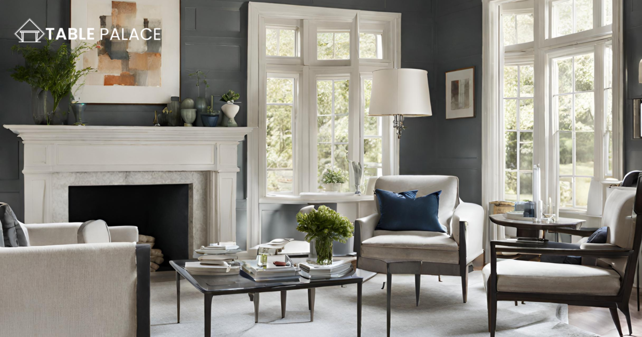
Focus on setting color schemes for specific areas like the living room, dining room, and entryway first. Extract one color from each scheme, such as toning down a red sofa to burgundy for accents in more secluded spaces like the den, office, or bedroom.
Refer to the Color Wheel
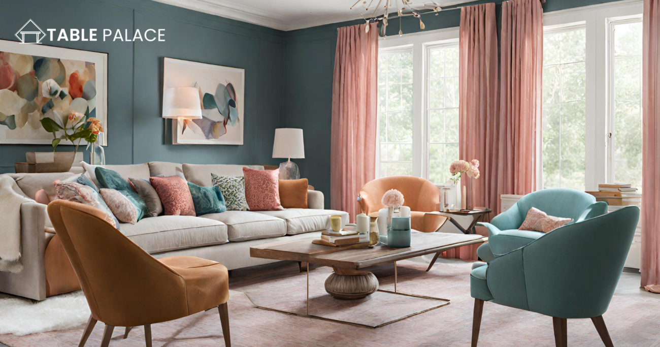
Generally, analogous color schemes—colors adjacent on the color wheel, like blue and green—create a casual and soothing ambiance, ideal for informal or private areas. This approach suits bedrooms, where relaxation is paramount.
Take Inspiration from Your Wardrobe
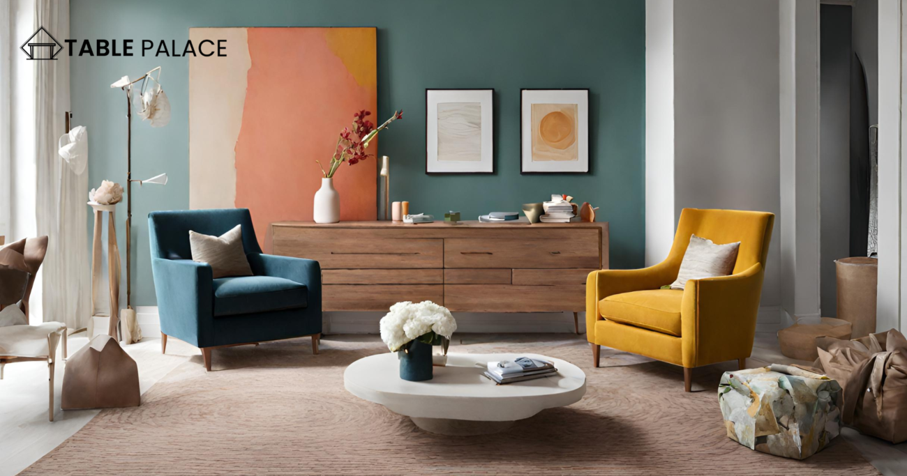
Just as people gravitate toward clothing colors they enjoy and look good in, rooms should be adorned in flattering colors. If denim is your preference, opt for a navy sofa. Similarly, if bright yellows complement your style, incorporate citrusy accents with pillows or accessories.
Embrace Black
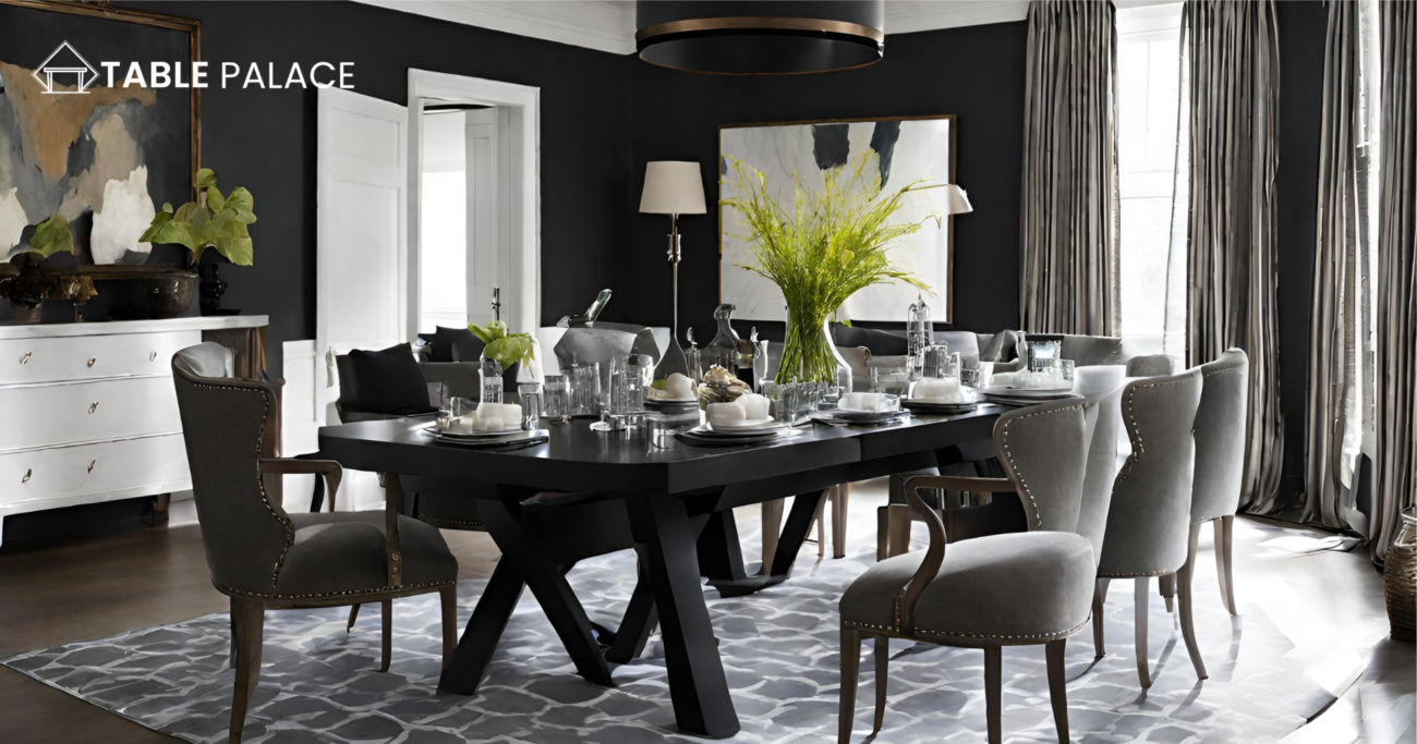
Designer Mark McCauley suggests incorporating black into every room to enhance the clarity of other colors. A black lampshade or vase adds subtle contrast, while painting kitchen base cabinets black injects drama.
Explore Shades of Gray
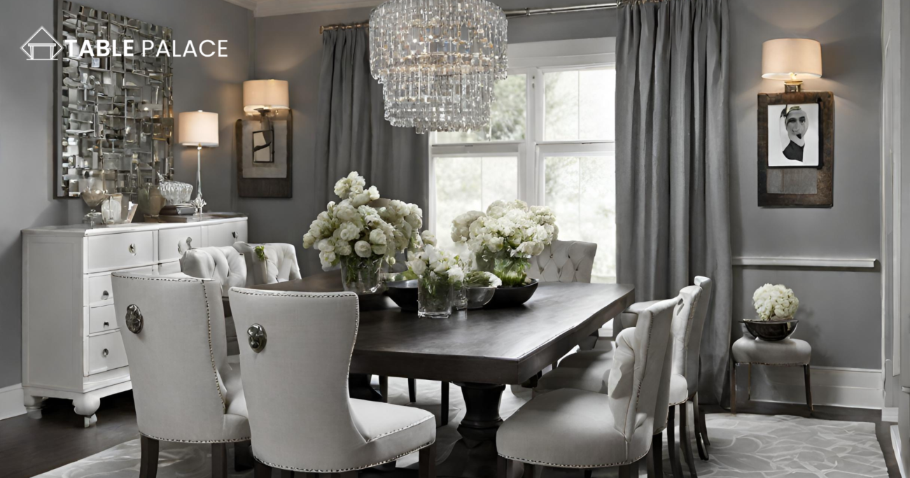
Utilize the trendy neutral, gray, in any interior style. Gray’s versatility allows it to adopt warm or cool tones and complement pastels or vibrant hues like hot pink, Kelly green, or citrus shades.
Follow the Rule of 60-30-10
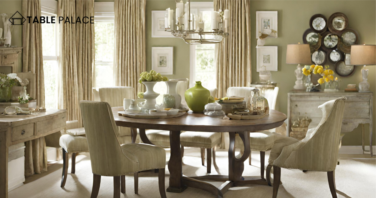
When decorating, allocate colors into components: 60 percent dominant color (walls), 30 percent secondary color (upholstery), and 10 percent accent color (accessories). This proportion ensures balanced colors with enough visual interest.
Enhance Small Spaces
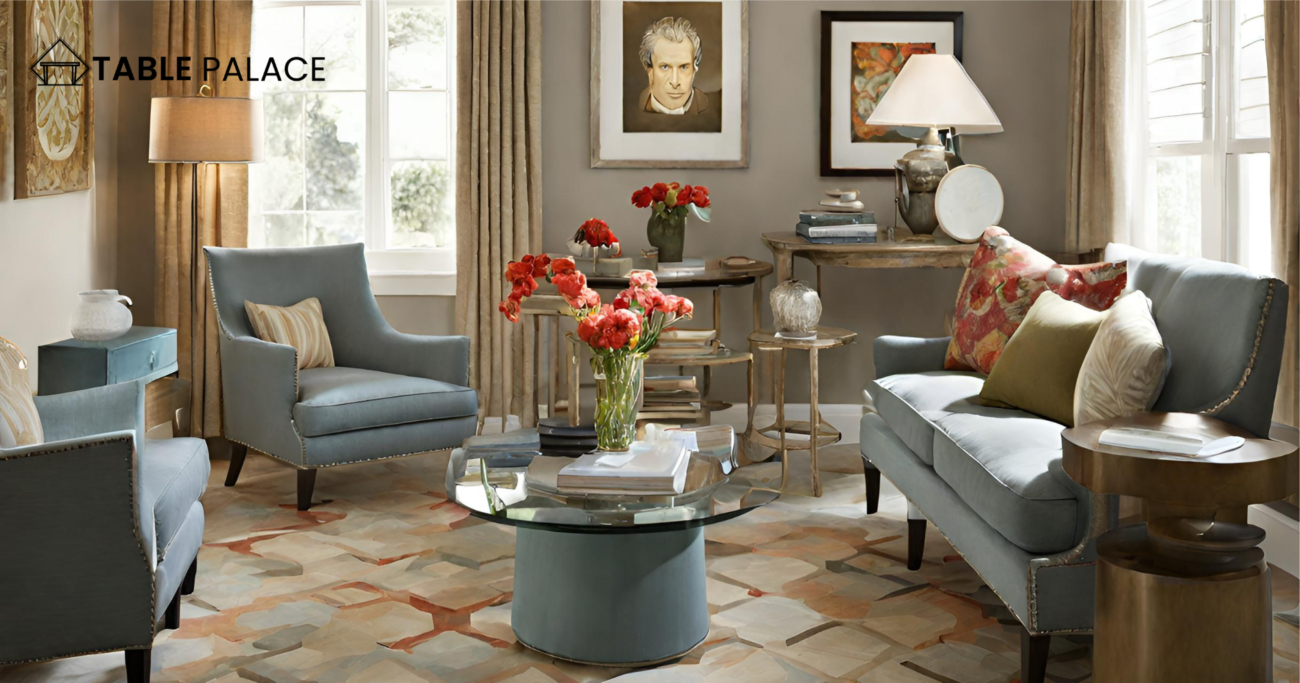
Avoid painting small rooms white to create an illusion of size. Instead, opt for bold color choices to add character. Let ample light expand larger rooms while cozying up smaller ones.
Contrast Warm and Cool
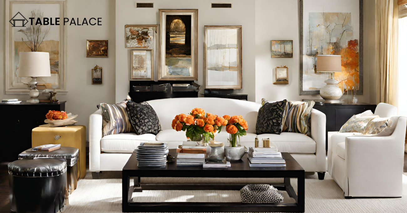
In this stylish bedroom, designer Brian Dittmar demonstrates that neutrals can be anything but dull by combining cool gray with warm honey-colored tones. Although the ambiance is calming overall, the comparison of these contrasting hues adds a touch of dynamism, preventing the space from feeling too subdued.
Rely on a Timeless Pairing
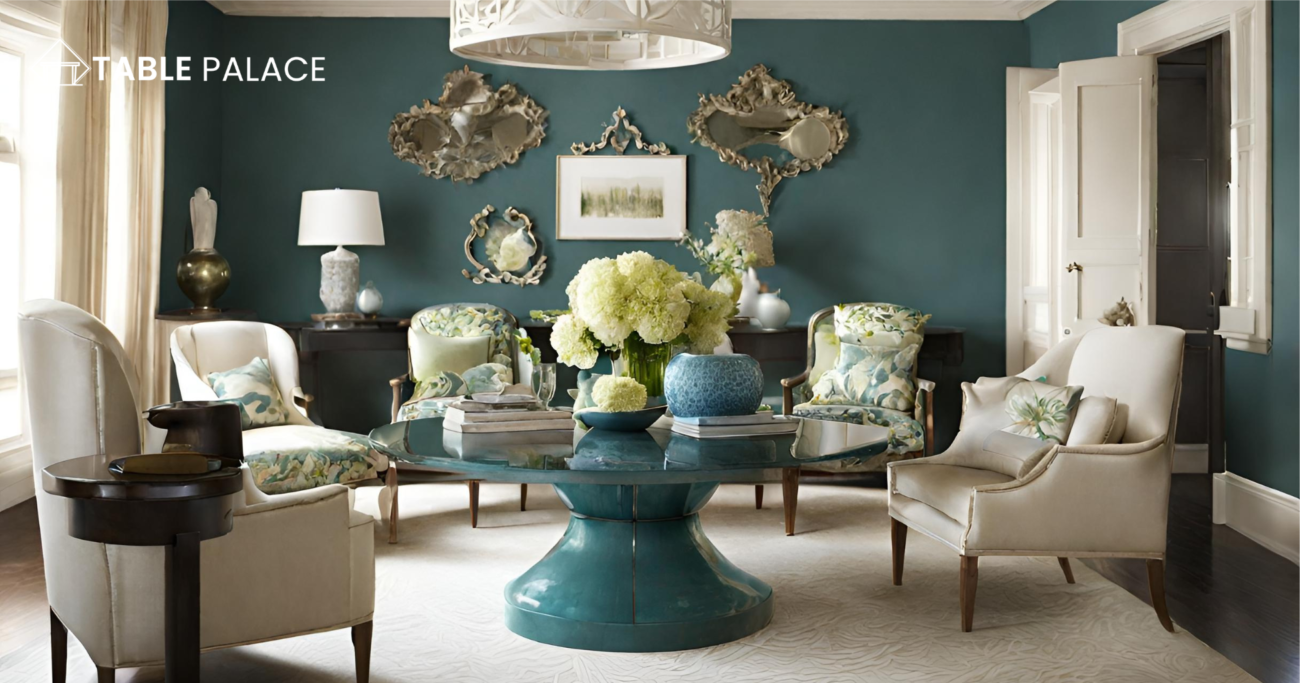
Black and white, perpetually chic, form an enduringly stylish pair. In this example, designer Tobi Fairley showcases how these two colors, augmented by a hint of metallic gold, suffice to craft a captivating color narrative.
Rock a Monochromatic Look
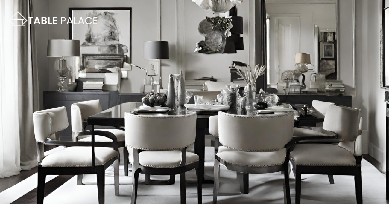
Highlight your preferred color by saturating a compact area, such as a bathroom, entirely in that hue. Designer Judith Balis exemplifies this approach with a cheerful master bathroom adorned in the lively Kelly green. Complemented by white walls and floors, the vibrant shade commands attention without dominating the space.
Conclusion
These design insights emphasize the power of color in transforming spaces, from creating harmony and balance to infusing personality and vibrancy. Whether through careful selection of color schemes, strategic use of neutrals, or bold statements with a single hue, each approach demonstrates how color can elevate and define the atmosphere of any room.

